

TurboTax Business helps small to medium sized businesses file annual taxes.
October 2006 - September 2007
I took on a design leadership role for the more established, broad TurboTax Business product.
Although initially hired for TurbTax Estimated Taxes, within a couple weeks of starting I also picked up a design leadership role for TurboTax Business. I contributed numerous changes and additions throughout the well established product. Most notably, I focused on simplifying problem steps in the workflow by removing jargon, making decisions easier to understand, and decomposing compound decisions.
Results
Contributed to improved year-over-year customer retention of more than 20%.
Materially reduced support calls and tickets for the most common problem areas.
Clarified expense reconciliation flows for both novice and expert filers.
Simplified the primary form (1120, 1065, etc.) selection process from a compounded 3-step process to a single step with far less jargon.
Increased observed confidence in expense reconciliation and form selection processes.
Conclusions
Support calls decreased substantially when these updates were released 2007 and 2008. Several workflows I designed remained principally unchanged for a decade or more after these releases, which suggests my contributions had continued success in subsequent testing and review.
Convoluted selections and jargon confused users.
An example from the project
Research
The TurboTax Business product is built on one of Intuit’s professional products. It is a fairly complete solution, but still contains quite a bit of content originally written for accountants. Critical areas of concern for this release included the form selection and expense allocation processes.
Principle skills
SSNiF identification
Heuristic analysis
Wireframes
Low-fidelity mockups
Visual design
Usability testing
Design improvements
BEFORE: Improved Return selection

The existing workflow used a three-step process to select the main IRS form to file (e.g., 1065, 1120S, etc.) with decisions around how to deal with employees.
Consider you’re a savvy employer, so already know you need to file a 1065 and several 1099-MISC forms for your contractors. Which radial choice would you select? Nearly 90% of consumers in usability tests didn’t know what to do either.
AFTER: Improved Return selection

The simplified flow reduced the process to just two steps without any compound or blind decision points. This now only deals with the question of the main IRS form, and separates out questions related to employees and contractors. Furthermore, by leveraging existing UI paradigms, we could reference the employee tools at various, contextually relevant steps throughout the process. And, with minimal new engineering effort given the reusable nature of the result.
AFTER: Improved expense examples

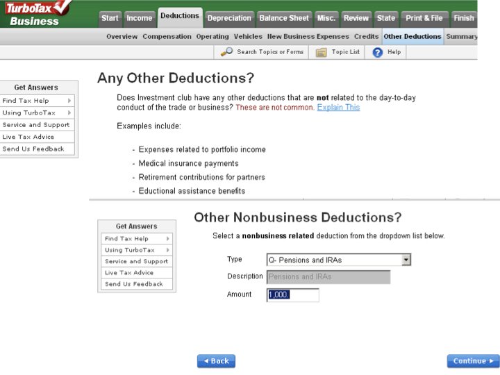
The single biggest problem small business owners have when filing taxes, assuming their books are accurate, is correctly assigning business expenses. To improve this process, we designed a novel way of customizing examples in each expense section. This better represents the type of expenses likely relevant to the consumer. For instance, a manufacturing plant business will show example expenses commonly associated with manufacturing, and hide other expense examples (e.g., farming).
BEFORE: Simplify retirement options
The original retirement UI required consumers to manually total contributions across partners (often across different screens). Validation would complain at the end of the process, but offered no hint numbers didn’t add up throughout the process. There was effectively no room for mistakes, and no assistance to avoid mistakes.
In addition, the retirement options were difficult to find in the navigation.
AFTER: Simplify retirement options
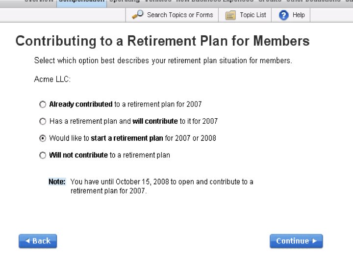
Substantially simplified navigation with improved UX ensured consumers found the retirement options, and could make effective use of them. Differentiated UX for common retirement scenarios helped consumers setup a plan, enter their contribution, and allocate among partners.
Project results
When updates were released in TurboTax Business 2007 and 2008, there was a marked decrease in support calls with improved retention. I only played a small part in this large, established product. However, some of the workflows I designed were still in use many years later; a strong indicator of the design improvements’ reliability.