

TurboTax Estimated Taxes helps people estimate, file, and pay quarterly taxes.
October 2006 - September 2007
Intuit initially hired me as a Staff UI Designer to support TurboTax Estimated Taxes.
I worked on many projects at Intuit; however, my largest contributions were to TurboTax Estimated Taxes and TurboTax Business. For Estimated Taxes, I redesigned the entire product from the ground up—designing a streamlined UX paradigm, new UI components, and an updated product brand.
Results
The setup experience for new users was decreased from a mind-boggling 14-steps to a much more reasonable 3-step process.
Increased the retention rate by more than 30%.
Decreased effort and time required to complete common tasks by ~50% on average.
Decreased support effort per active user by more than 25%.
Generated over $400k additional ARR after improvements. That’s more than 40k additional active users.
Improved marketing spend efficiency with reduced abandonment, which improved the overall profit margin of the product.
Conclusions
The simplified workflows and design tested very well in usability. Engineering and support costs decreased; revenue increased; profit margins improved. The new designs performed as well as anybody could have hoped, and were produced on time and under budget.
The team performed admirably, and the results speak for themselves.
Confused navigation and complicated on-boarding workflows.
An example from the project
Research
We conducted several usability and marketing studies from late 2006 to early 2007. Studies included eye-tracking, ethnographic research, usability testing with proposed designs, and general marketing panel discussions. Each study focused on different aspects of the user experience.
Our observations from the research fundamentally fit into one of the following categories of questions.
SEO. How do people find the solution, make their purchasing decision, etc.?
General tasks. How do people create an account, start using the application, etc.?
Common application tasks. How do people update estimates for each quarter, add major events, etc.?
Uncommon application tasks. How do people migrate their estimated payments into an annual tax product (such as TurboTax), plan for the following year, etc.?
Principle skills
SSNiF identification
Heuristic analysis
Wireframes
Low and high-fidelity mockups
Visual design
Usability testing
Product management
Engineering management
Key learnings
A majority of our users were elderly retirees.
Refocusing the application on an uncluttered visual space could substantially improve accessibility with an audience much more likely to have limited vision, fine motor control, and similar concerns.
We saw very high rates of abandonment during onboarding and initial use.
Clear calls to action (CTAs) were missing on key marketing landing pages, which left people wondering how to get started.
The onboarding process required 14 individual steps. Several of these were redundant or could be delayed till much later in the process. For example, configuration needed to submit to the IRS was prematurely collected before even establishing estimated tax filings were necessary for the new user.
Each step also created new opportunities for friction and frustration to build toward abandonment.
This audience had trouble finding where the tasks lived, and weren’t certain when they completed a given task correctly.
People only needed to update or file something once a quarter. So, every visit required relearning the application, and many design decisions prior to my participation failed to appropriately account for this uncommon and infrequent usage.
Existing users were less troubled by subsequent quarterly and annual tasks.
Comfort with the product grew after each success with solid feedback loops. In short, quickly building strong user confidence that they were using the product correctly could substantially improve retention.
Design improvements
BEFORE: Clarified landing pages

This landing page attempted to be everything to every audience. So, it generally failed to convert new customers, and consistently confused returning customers. Additionally, the limitation of using a single landing page for the majority of incoming traffic limited the efficacy of marketing efforts.
AFTER: Clarified landing pages

We created new landing pages with far less information density and clear CTAs. These allowed people unsure if they needed to file estimated taxes to quickly find tools to help them answer this critical question (on separate, content focussed pages). Simultaneously, those who already knew they needed to file estimated taxes could more quickly start the process.
Additional, specifically tailored landing pages were created for ad campaigns and other entry points for new customers. These focussed landing pages gave marketing tooling required to meaningfully improve the conversion rate of new customers.
BEFORE: Simplify onboarding
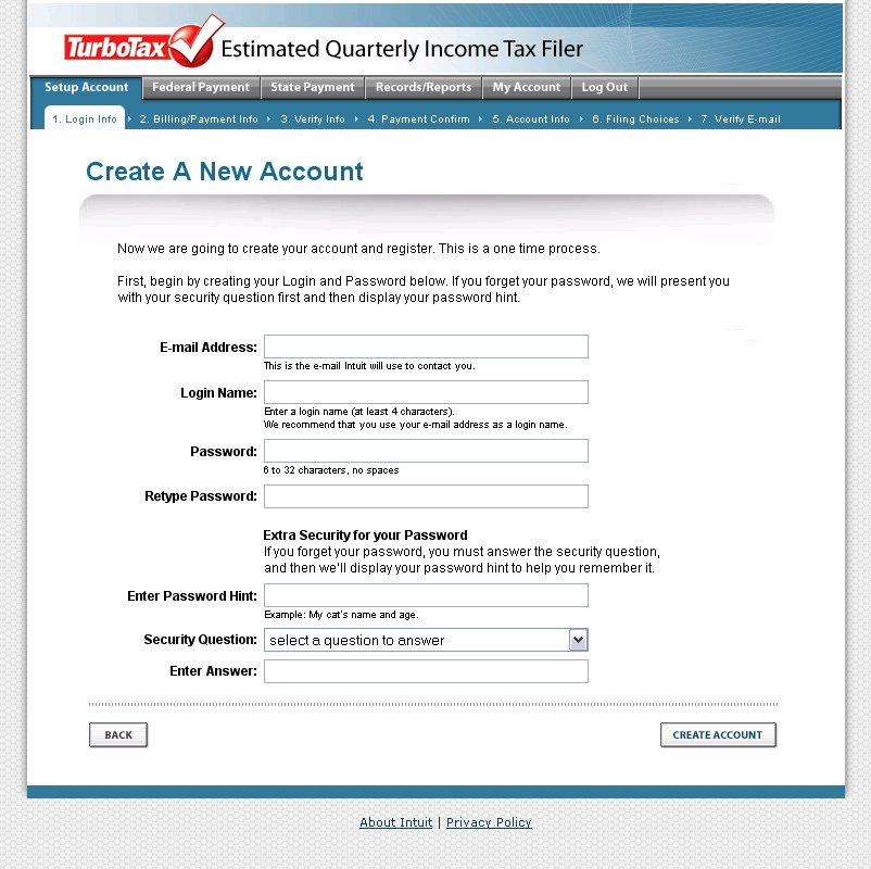
An overwhelming number of steps, many containing extraneous or redundant data collection, created large hurdles for onboarding customers. Sometimes the same information was collected on multiple steps within the same onboarding process. For example, the email address and name were both collected on multiple steps.
Unsurprisingly, this confusing workflow lead to high drop-off rates throughout the onboarding process.
AFTER: Simplify onboarding

By refactoring the information architecture from the ground up, we were able to remove many hurdles in the onboarding process. This example combined five screens from the original onboarding workflow into a single step.
The updated workflow only collected necessary information when it became necessary. Additional information was collected later as needed throughout the process. For example, there’s no need to collect information needed to submit a file to the IRS until filling with the IRS.
Ultimately, this one change simultaneously increased revenue generating conversions while reducing marketing spend and support call expenses.
Guide returning customers

Next, we redesigned the home page with a quarterly checklist metaphor to guide customers toward outstanding tasks based upon their needs. The checklist included steps required by the IRS, data that failed a variety of cross-checks ensuring accurate entry, and any other points of concern. This further decreased confusion by providing a clear set of objectives each quarter.
Highlighting milestone dates, and promoting relevant help documentation further focused both experienced and new customers. This substantially reduced common support requests by facilitating better self-serve options, and helping customers build confidence in themselves and the produce.
Simplify filing with the IRS

Lastly, we simplified the filing to a single screen from a four-step process. Removing numerous opportunities for defection and confusion along the way.
Core navigation, account management, reporting, and the estimated taxes calculator were also meaningfully improved.
Project results
As previously described, the designed changes lead to massive improvements for all business KPIs. The design process produced a textbook exemplar supporting research-driven, human-centered design principles.
Furthermore, the experience helped me mature my design techniques, and particularly how I integrate research findings into subsequent iterations. For example, an early iteration attempted to simplify the navigation with a tree-navigation paradigm. I was initially surprised to find how badly this tested. In retrospect, it seems pretty obvious. Several academic studies have shown people generally struggle with hierarchal information architecture models in UI. Hyperbolic trees work a bit better, but come with their own limitations and complexities. I obviously hadn't read this research until after completing our studies, but it’s reassuring academic research supports the conclusions drawn here as well.
I was able to take learnings such as these, and design an alternative approach in an hour or two between test subjects. I was able to modify everything on the fly thanks to a reasonably well designed approach to mockups with the tools available at the time. Rapidly adapting didn't slow down the process, and allowed for much deeper learning than was typical for the budget and time allocated.